A good number of our DataFlex applications in the Desktop world, both character mode and windows have not used the standard user interface provided by DataFlex.
That is not to say we have not used it at all but especially in commercial applications we generally decided to go a step further and offer a better user experience.
This was generally done by using a drill down type interface. In my opinion even though it is a bit more work to create especially because it is not provided out of the box the drill down interface is much more user friendly and less confusing.
Of course we needed to provide the same experience to our end users in our web applications.
We have already built mobile type web applications with DataFlex which of course already provides a drill down interface but for our desktop type web applications we did not want to build on top of that as there was too much base functionality we didn’t need.
So we decided to build a framework for use with the DataFlex Desktop web applications that would support our style of drill down interface as well as user interface controls that we wanted to be able to support.
The Windows application made use a shortcut bar as its main menu and a ribbon bar that automatically changes based on the context the user is in. As far as user interface controls we used lists and property panels to show data, trees for drill downs, calendars, Gantt displays, multi list selection with drag and drop and more so we had to find ways to add these to DataFlex as well.
As far as some of these user interface controls are concerned we decided to use controls from DHTMLX.
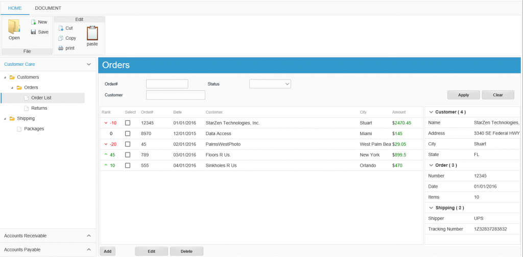
They seem to integrate rather well with the DataFlex framework and we were able to solve some of the above requirements. For some of them we decided to build new JavaScript controls from scratch. While this is not completely finished as of this writing here is an example of a sample application screen

On the left side we have a shortcut bar that is used to navigate the views of the application. At the top we have a ribbon bar with tabs. The ribbon bar shows actions that the user can apply to the current element. These actions change dynamically as the user navigates the application
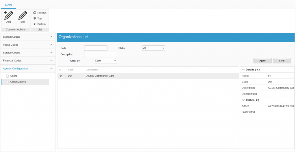
Next up a screen shot of the same user interface in an actual application. The application is still being worked on and we have not done spent any time on graphics such as icons and styling.

Ribbon Bar
The ribbon bar is global to the application. It can have static items that are available at all times but we also built a fully automatic system to add, remove, enable and disable actions based on the navigation by the end user.
In a view and also in specific objects such as lists we have a system that tracks ribbon bar action objects placed in these objects. They work similar to a button except that instead of showing a button on the view they add an action to the ribbonbar.
When the user clicks on one of the ribbon bar actions the OnClick method inside the action object is called. When the programmer enables, disables or hides action objects the attached ribbon bar object automatically synchronizes. When the user navigates between views the ribbon bar contents are updated with the actions from the current view.
View Components
in the view itself we have a number of components.
Title Container
The title container is the blue container showing the name of the view or sometimes also more detailed information on what the view contains
Filter Container
the filter container is the container right under the title container. It contains objects to define filters that allow the user to narrow the list data
List
Obviously the main component is the list itself. We are using the DHTMLX grid control here.
Property Grid
To the right of the grid and sometimes also underneath we use property grids to show detail information for the selected row in the list.
The property grid is a special class we built based on the DHTMLX grid class.
Editing Data
In our windows applications we had implemented two distinct styles from this point. Popup editing vs In place editing.
Popup Editing
The first style which is the simpler one to implement is popup editing. As the name implies when the user edits data a popup appears that allows the user to add or edit data. It is a lot simpler from a programming standpoint. It is modal so we do not have to worry about the global objects such as the ribbonbar and shortcut bar. Of course on the flip side we also loose the capabilities of the ribbon bar. In the windows application that uses this style we do have popups that have a ribbon bar on the popups as well.
In Place Editing
In Place editing essentially replaces the contents of the list view with a data entry view. When the user saves or cancel the page flips back to the list view.
Both styles have their pros and cons. For this Webapp we decided to implement to Popup Editing for now.
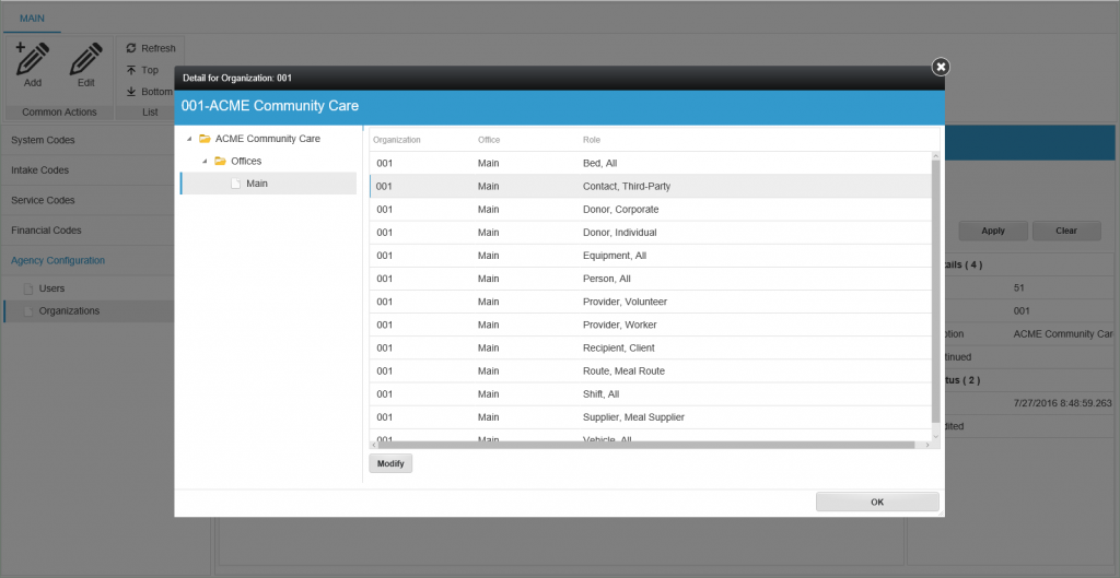
Here is an example screenshot of one of the editing dialogs.

When the user clicks the edit action on the ribbon a popup appears. Depending on the data the popup can be a simple data entry popup or as in the above example a popup that again shows a drill down interface using a tree and multiple list pages. Depending on the tree item selected the area to the right shows different pages that can be data entry pages, list pages, reports, calendars, etc.
Multi list Selection Dialog
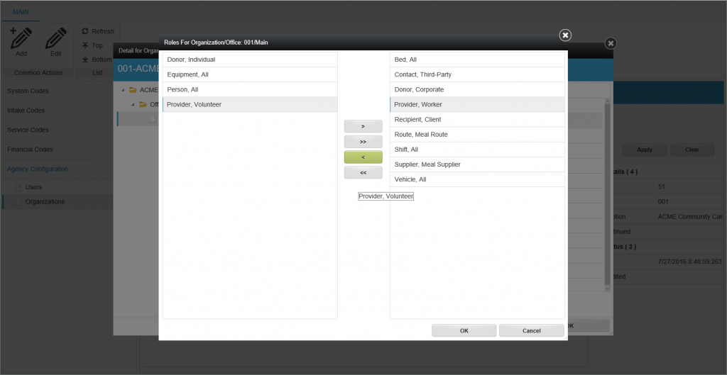
Another user interface element used in these applications is a multi list selection dialog. Essentially a dialog that has two lists side by side and buttons to move data from one list to the other. The left list shows the data available and the right list shows the data selected.
The lists also support drag and drop as well.
When the user clicks the Ok button to save the lists figure out which records to add to the database and which records to delete.

This is it for this first part on this user interface style. We will be adding more detail as we go along.
